
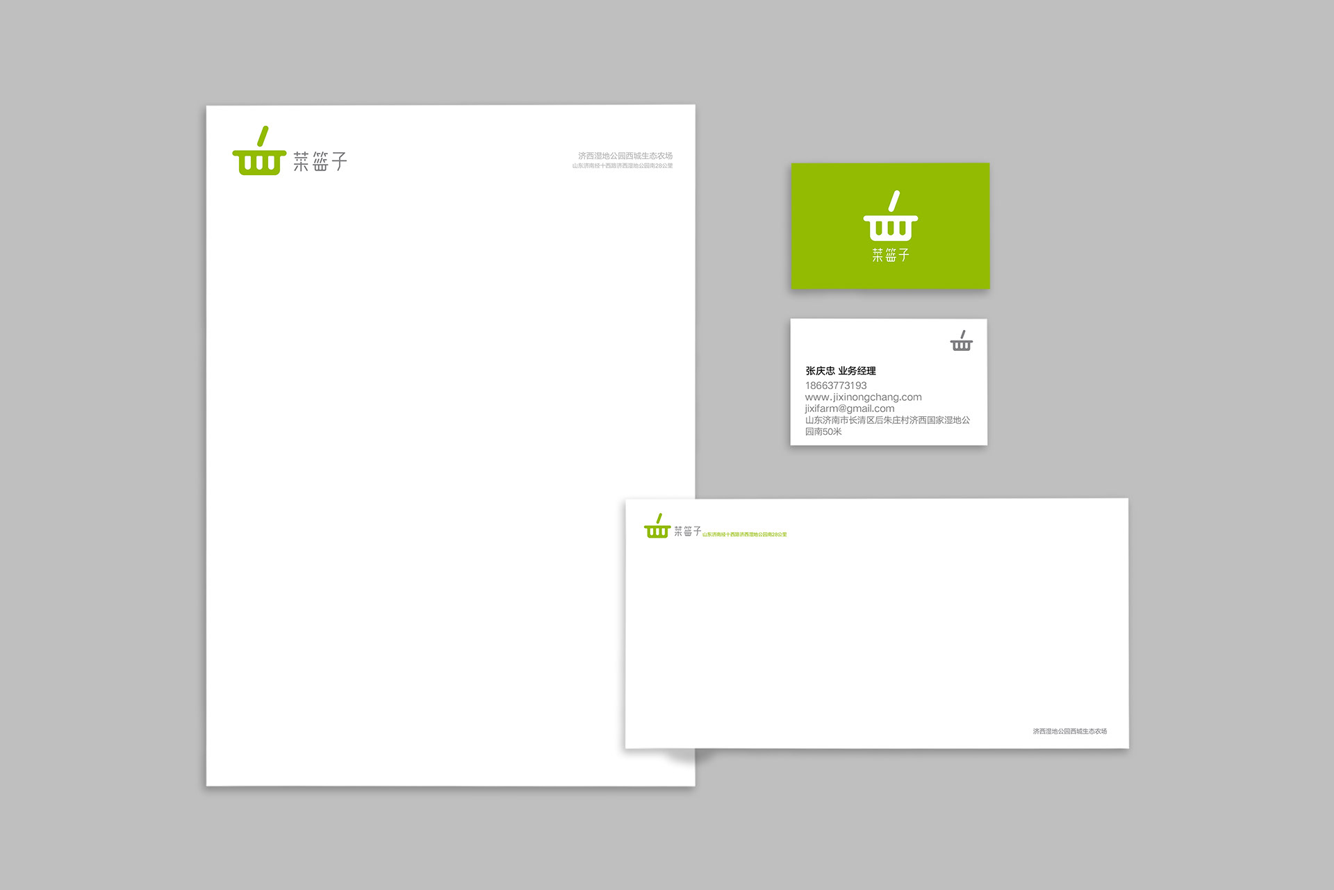
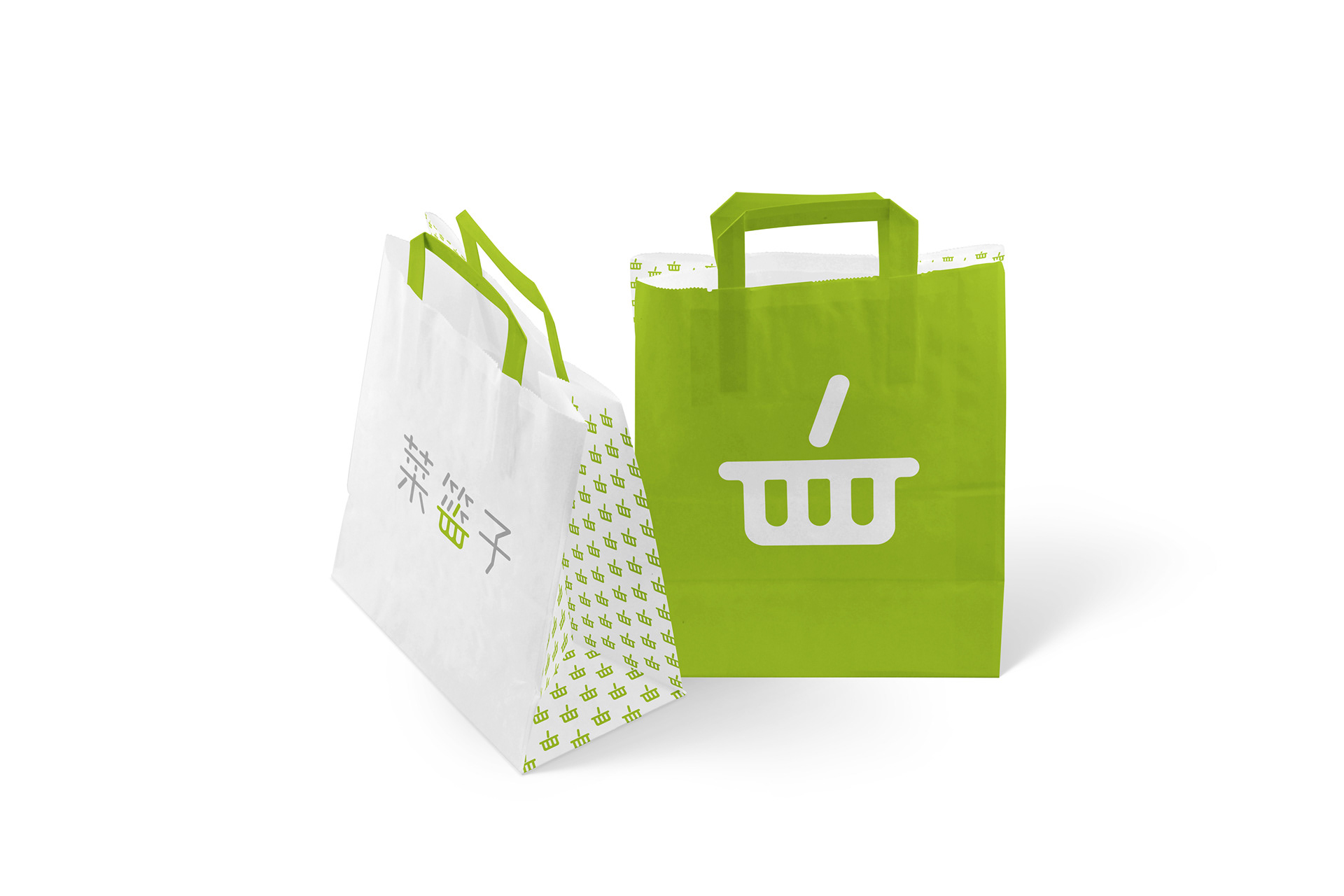


“菜篮子”工程为济南当地居民提供有机健康蔬菜水果的项目。它的特点是健康,绿色和便利。 标志是由两部分组成,一部分是菜篮子的logo图形,另一部分是标志字体。logo图形来源于”篮“字的一部分,将”皿“字上下180度翻转就形成了菜篮子的图形。 CGDA2018设计奖 - Fresh Basket is an initiative dedicated to delivering organic foods and produce to communities in Jinan, China. The identity design challenge was to craft a typeface and graphic that clearly convey the project's focus on community and personal well-being. The design journey began with the project's name, 菜篮子, meaning 'basket' in Chinese. Inspiration was drawn from the lower portion of the character 篮 (lán), represented by 皿 (mǐn), which symbolizes an inverted basket. This imagery evokes the notion of fresh greens being brought directly to people's homes in a basket. CGDA Design Award 2018